
is what happens when you let paid, professional journalism die a slow and painful death:
You get wonderful insights like this from the University of Iowa’s creative writing program.
is what happens when you let paid, professional journalism die a slow and painful death:
You get wonderful insights like this from the University of Iowa’s creative writing program.
My alma mater, the University of Alberta, just hosted a fascinating exhibit that melds art, science and medicine together. Entitled “Insight: Visualizing Health Humanities” the exhibition showed multiple manifestations of design & health coming together in vastly different—and highly personal—interpretations.
The 32 submissions in gallery of the Fine Arts Building ranged in format, focus and message: from the poetry of a cancer survivor to a 3D diorama of a seniors-enabled home to a video on Mongolian spiritual rituals to something called the “Phantasmagoric Amphygorium of Dr. Wybury.” Each represented how human needs relate to healthcare and the practice of medicine. In other words: health humanities.
As noted by Dr. Alan Bleakley, a professor of medical education in the UK, “the culture of medicine has little tolerance for ambiguity and uncertainty.” This is a culture is built on precision, analysis and reliability. In other words, the opposite of “medical arts,” which are intuitive, immeasurable and subjective (in my mind, this harks back to Rotman Dean Roger Martin’s “reliability vs. validity” paradigm). Whereas the steady march of medical science in the 20th Century removed doubt to determine answers (Bleakley cites the use and overuse of medical screenings as a day-to-day example) medical arts are making a comeback in the 21st, reveling in their inherently ambiguous nature.
As Insight demonstrates, if we reframe the medical arts as health humanities, then we are left with a truly staggering number of influences to comprehend: “literature, narrative medicine, history of medicine, philosophy and ethics, medical anthropology, medical sociology, environment and health, art, visual culture, health design & communications, drama, music” to list just a few. And as every graduate student learns early on, any particular field breaks down into further levels of exploration. Co-curator and assistant design professor Bonnie Sadler-Takach cites the visual arts, which alone “encompasses health information design, health communications, knowledge translation, information and data visualization informatics, visual research and discourse analysis, visual rhetoric, semiotics, visual representation, visual grammar, visual literacy, visual communication, visual culture, visual identity design, public graphics and more.”
The idea of using art for therapeutic, restorative or palliative purposes is a relatively recent one, going back to the 1930’s & 40’s. Over the last 5 years the U of A has made concentrated efforts to explore, blend and crossbreed these disciplines. This, according to Pamela Brett-Maclean, the director of the university’s Art & Humanities in Health & Medicine Program, makes this exhibit unique: “This is the very first time design has been used to examine the potential of an emerging field (such as health humanities).”
Underscoring this point, Sadler-Takach said the idea was to have not only artists but anyone connected with the U of A (one of three prominent health humanity programs in Canada) submit works that “weren’t just living in the design space, or weren’t just living in the health space.” That’s not to say designers didn’t play a part–more than 60 visual communications design students helped visualize and brand the project. “As a designer, this seemed to be an optimal project to see what health humanities could be and what healthy societies can be.”
With pieces ranging from the plight of homelessness to therapeutic journeys on bicycles to feminist critiques of body imagery, critics might say the exhibit lacks focus but that is precisely the point. The goal was to challenge conventional models around health and wellness so the curators pointedly refused to limit what expressions could be submitted. “We wanted very much not to fit everything into little spaces but rather have the viewer make their own connections,” says Sadler-Takach. “We had a feeling there were people working in different areas who maybe felt isolated or didn’t quite fit in a specific space but they knew it was important and compelling so we thought we could bring some folks together to see how it could add up. Its called an exploratory exhibition to translate knowledge in ways that are innovative, accessible and engaging. The third member of the curatorial team, Aidan Rowe says “This breadth of form of submission and the wide range of exhibitors speak to how far this nascent field has progressed under individual pursuit.”
16 different faculties and units across the university were represented at Insight. Sadly, dentistry was not represented. As the son & brother of dentists, I can kind of see why that is. However if they’re ever going to make a visit to the dentist less scary than the fear of death itself (and make a dent in this morbid urban legend), then participating in this conversation would be a start.
Next year, the organizers plan to stage a similar exhibit but open it up to submissions beyond the U of A. Ultimately, they hope Insight can open the door to a possible undergraduate certificate or even a Master of Arts degree in medical health humanities.
The Edmonton Journal‘s Ray Turchansky interviewed a local economist out with a new book about what’s missing from the Canadian economy: creativity.
Speaking with Alberta Treasury Branch‘s chief economist Todd Hirsch, Turchansky notes that for far too long, we have relied on our status as “hewers of wood, drawers of water” to fuel our prosperity (no pun intended, Alberta). Even without the current resource & commodities boom that’s driving Western Canada and keeping the country as a whole afloat during these difficult economic times, its been evident for quite some time that Canada suffers from a “productivity gap” compared to our southern neighbors.

This gap is literally visible in the US’s consistently higher GDP per capita and I think it’s also intuitively felt when companies and talented workers migrate south to get a bigger bang for their buck, though admittedly, this gap now seems to be closing for the first time ever.
(It ain’t because we’re suddenly innovating– a contemporaneous piece in the Globe and Mail cites the usual frustrations SMEs have in Canada: small venture capital market, taxation structures, a lack of coordination between public & private agencies, few mentors and weak commercialization processes.)
Much of this is a result of our own complacency. Hirsch, who looks a bit like Rick Moranis with windswept hair, says “we need to stop asking the government to make us productive and creative.” He & Robert Roach have authored a book that tackles this issue: The Boiling Frog Dilemma: Saving Canada From Economic Decline. The title’s a bit alarmist but he does make a few salient points.
Hirsch offers some interesting anecdotes around creativity and the subsequent lack thereof, such as our increasingly rigid educational system (when “our crayons are taken away”) and the Overseas Experience (i.e. “Gap Year” ) that Australians and New Zealanders regularly take in between finishing school and starting work to refresh and rejuvenate themselves.
This is not to say that Canadians aren’t creative–witness everything from the invention of insulin to the construction of the Canadarm to Research In Motion–but for the most part Hirsch says we are too comfortable in our abundance. And it’s not like the opportunities aren’t there: as one of the world’s energy hotspots, Hirsch says Alberta should be leaders in areas of relevance such as carbon capture & storage technology.

(my favourite example)
Interestingly, the article finishes by looking at what he considers the three components of applied creativity: invention, innovation & design. Innovation is a tired, overused term while design is the easiest and most economical to build upon, according to Hirsch. (I would posit that design itself is in danger of being beaten into a cliché. Time for a new word but more on that later).
He cites the world’s number one firm as an example of how to “do” it right: “Apple doesn’t really invent anything, it just takes existing technology and adds tremendous design that people connect with.”
The city of Edmonton has produced a nifty little guide to showcase nifty design highlights among its newest communities.
Entitled “Designing New Neighbourhoods“, the 48-page report is a product of the city’s municipal development plan, “The Way We Grow” which is itself part of a series of high-level plans for the next 40, 50 years as the capital city of one of the world’s energy hotspots.
Designing New Neighbourhoods highlights some of the best practices in the city’s newest areas such as Windermere & The Orchards in the far southwest, Summerside in the southeast, Lago Lindo, Schonsee & Griesbach in the north end of town.
Each highlight has a photo listing the neighbourhood feature, its location and nascent benefits to the surrounding community.
The accolades are categorized according to 9 major urban design considerations:
There’s a major emphasis on natural settings which is interesting given that a lot of people in Edmonton are talking about urban farming lately.
Some might see unintended irony in oil field service workers bombing down the Anthony Henday freeway in their F-150s from the big box stores of South Edmonton Common to disembark and enjoy “new urbanist” practices of intimate, walkable neighbourhoods.
But when the majority of infill development in this city tends to be highrise condos, it only makes sense that these ideas would be put into practice where land is cheap and demand high. Given that the capital city region is expected to add as many as 75,000 people over just the next five years I think its worth applauding anywhere pedestrian-friendly, close-knit public spaces can take root. Even if they are in the suburbs.
The city has invited feedback at www.transformingedmonton.ca.
Banks are lousy at social media. That’s been proven over and over recently.
Or has it? Just because a bank maintains the slimmest of presences compared to other brands doesn’t mean its “lousy” at social media. Maybe its by choice. One could easily argue that banks just haven’t fallen for the hype around social media and squandered a once-in-a-lifetime opportunity to establish a narrative by acting in haste. Canadian banks in particular maintain an almost literal facade over their respective Facebook or Twitter personalities with little beyond the obligatory Wikipedia entry, some basic contact info and the barest idea of what it actually does.
Up until now, I don’t think this was a bad thing. Think about it–Social Media (not even a generation old and inherently skewed to Millennials & “digital natives”) and some of the world’s oldest institutions. Precociousness v. Prosaic. How is that going to go? Given how badly or awkward social media efforts by brands can be, seeing an inherently conservative entity marching onto Facebook like any other brand would look like your dad trying to get on a skateboard for the very first time: tragicomic.
In this sense, I think the banks acted wisely. Why mess with a medium that, however intriguing, has a limited impact on your core business, is far from where all the real action is (entertainment and consumer packaged goods) and can so easily backfire? The learning curve is steep and companies fundamentally lose a certain aspect of control when they venture into new media, so hesitation on their part makes sense. Take Facebook Walls for example–look at any company that lets users post anything they want about the company on their Walls and it quickly morphs into a “Wall of Shame” by embittered & unhappy customers. Even more so, legitimate statements by the bank or its officials can be reinterpreted completely independently and often incorrectly. Better to wait and see how this plays out then act decisively.
Still, social media is not to be ignored. According to this recent report by Accenture, that time is running out. It predicts that up to 90% of banks plan to devote resources to social media in 2012, including as much as 10% of their marketing budgets (and by now it goes without saying how influential social media itself is).
In a way, the script is already set: banks are in a particularly interesting place given that they serve an essential function in any consumer society (hence the not-insignificant barrage of privacy, legal and regulatory issues to deal with) yet so many of us engage with them almost entirely online, with little or no “real” face-to-face interaction inside an actual branch. So a virtual relationship (and a pretty important one at that) already exists. The question is how can you explore that one without endangering the “real” one?
So if banks are going to bravely sally forth into highly capricious territory, perhaps design thinking can show them a way forward. Some banks have already started doing this. As I mentioned in February, Fidelity worked with Stanford’s “d.school” to re-envision its website for a better user experience and ended up with some interesting results.
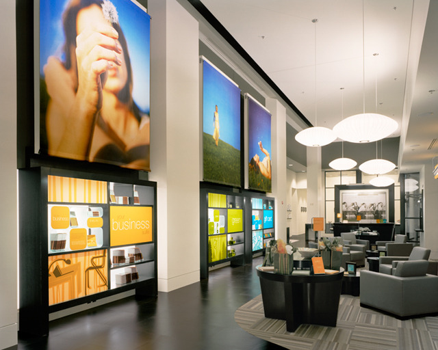
Similarly, with online banking obviating the need for branches, some banks have used design thinking to completely redefine them into cheery, sociable “branches of the future.” To my knowledge, the first was Umpqua Bank in Portland, Oregon (cheekily-styled “the World’s Greatest Bank“), designed by Sohrab Vassoughi & Ziba Design. It has since caught on here in Alberta with Alberta Treasury Branch opening sleek and opulent branches in upscale Edmonton & Calgary locales via the firm Karo. Some of these design-inspired features include open-concept lounges, concierge-like service and even something called the “Wow Wall” that interacts with passers-by as they well, pass by. Not only does this revive an area of the business badly in need of reinvention, it establishes a customer-friendly personality. And the results seem to be positive.

So if design thinking can unleash all that with a willing client and result in happier customers, just imagine what it could do in service of customer relationships via the many social media touchpoints between institution and customer–everything from advertising & promotions to loyalty programs to allowing user-shared reviews to the direct proliferation of financial advice to allowing actual transactions. All guided by design principles like storytelling and ethnography. The possibilities for banks and social media are tremendous. And approaching fast.
Another fine article from the Atlantic’s Alexis Madrigal on the future of the Internet and the Internet Economy and most importantly, how it needs to be re-calibrated.
He references some not-too-distant (or difficult) predictions made in Wired Magazine way back in 1999 that have since come true, mostly regarding mobiles, flat screens and the near ubiquitous presence of technology through our latest technological advent, cloud computing. Its great. We’re all irreversibly and annoyingly in each other’s faces all the time…so now what?
Specifically, his point is a fairly simple yet devastating one to grasp–by overwhelmingly focusing on “apps” that fit within the envelope of the big guns (Facebook, Google, Apple, Microsoft, RIM) entrepreneurs, developers & techies are gearing innovation on the Internet as a whole towards the small, the narrow and the niche. Rather than looking at technology broadly, most commercial innovation ends up being about making something specific for a small group of already-committed users. Usually its to the great indifference of the rest of us and along now-tired business models such as “freemiums.”
“Thin-slicing the edge of the wedge” as I like to think of it.
Rather, he says its time to move on to the next stage of technological/industrial escalation.
I agree. It is truly a remarkable achievement to have established instant connection (and distraction) for nearly everyone. But now its time for the Internet/networked world to take the next step in broadening the human horizon.
Is there a tension between design and place?
This thoughtful article from the Project for Public Spaces suggests there might be. Naturally, it favours more of the place-centered approach but the interesting dynamic seems to be how much importance overall context is given in designing a new place.
A Design-Centered approach is “project-driven, discipline-based” and relies on a “lone genius” (i.e. Starchitect) to create “an all-or-nothing approach” that results in a “look but don’t touch mentality”.
Whereas a Place-Centered approach is “place-driven, community-based” and “looks for partners, starts small and builds up” to create an “accessible and inclusive” place that is “never really finished”.
Naturally some would quibble with what may seem to be arbitrary distinctions. And of course there would be natural overlap between these categories. But it does raise an interesting point about whether designers left alone in their ivory towers and white hats might be missing something when it comes to building for their respective communities.
The Economist has a nifty article on the India Design Forum here. Its the first ever event of its kind held in the country, and as the article makes clear, it suggests that India is still a ways off from embracing design unlike some of its industrialized counterparts.
Part of this stems from an indifference/ignorance in the possibility of design. Another reason the article suggests is that “design” is pigeonholed (or perhaps ghettoized) as solely an attribute of the creative sector: “Companies live on design but don’t see it as an important function,” says Rajshree Pathy, the organizer of the event and the curator of the Coimbatore Centre for Contemporary Art.
Still, potential seems to be on the horizon: 100 of the roughly 700 people in attendance were students.
Perhaps the Rotman School of Management, with its emphasis on melding design with business as a “B+D School” and Dean Roger Martin’s interest in establishing relationships with India’s education sector could be of assistance?
The Atlantic has an article on the history of playgrounds!
As detailed here, playgrounds in America were the product of the urban industrial age, with the first one constructed in San Francisco in 1887 (it featured a goat!).
Within a few decades politicians and reformers like Teddy Roosevelt and John Dewey were claiming playgrounds were good for children’s souls. A few decades after that, the article shows how they were commonplace in outdoor parks and near schools, but also in McDonalds and other corporate venues.
By the 1980’s the litigious backlash ensued as this helpful image demonstrates:

All of this culminates in the “no running” playgrounds for the progeny of Gen Xers as detailed in a New York Times Article.
So what will the next generation of playgrounds look like? One suggestion is “pop-up” playgrounds that open up on city streets for a temporary period.
That’s interesting but I think design thinking applied to child’s play could be a wonderful exercise here. Or maybe a redundant one–what else could be more tactile, stimulating and fun than a kid’s playground already?
Here in my hometown of Edmonton, the heart of the public library system (the Stanley A. Milner branch) is about to undergo some frontal renovations to….cut crime?
There is talk of redesigning the glass entrance to the hulking concrete structure in part to conserve energy and beautify an otherwise utilitarian facade but the real benefit may be on cutting down the number of police-reported incidents and disturbances, which have ranged from 41 to 72 per year since 2009.

Would YOU borrow a book from HERE?
I can definitely see the need. Being in the heart of downtown at the intersection of 102nd avenue and 100th street, the library sits along a major transit artery with buses from all over the city disgorging just a few feet away from the entrance. Passengers there would notice the entrance is a popular spot with wayward youth, the homeless, transients, people with special needs and downright shifty characters. This is especially true in the afternoon and early evenings when lurking miscreants can make waiting for the bus a downright unnerving experience.
Unfortunately this is more than just idle speculation. As anyone can see (or could have predicted), Edmonton’s crime rate–especially for murders–has floated up just like the price of a barrel of oil in summertime. All 48 for 2011 have been listed here (48 puts us only behind substantially smaller Winnipeg with its 34 murders for killings per capita).
While nobody has been stabbed to death after checking out “Henry and the Paper Route” the entrance to one of the city’s main civic institutions is still way rougher than it should be. This is especially ironic given that the Library isn’t in some forlorn corner of a concrete jungle but sits opposite Churchill Square, the city’s central plaza. Its part of our cultural cluster with Canada Place, the Citadel Theatre, the Winspear Centre for Music and the Art Gallery of Alberta all just a stones throw away to the east and Edmonton Centre and the city’s office towers just west of it.
Anyways, back to design. The story suggests the library has already benefited from “crime prevention through environmental design” (or “CPTED”) with innovations such as access- and barrier-free entries and greater surveillance. As you can see, the entrance is already a little forbidding with all the glass and concrete (imagine what its like when its pitch black and -30 outside!). Now has this design and the resulting environment it’s created actually resulted in crime? Well that may be going too far but I certainly believe better physical design can make a space warm and inviting rather than compartmentalizing and restrictive.
This story coincides with the recent passing of James Q. Wilson, the famous political scientist behind the “broken windows” theory of crime (published in my fave magazine, The Atlantic Monthly in 1982). In a nutshell, Wilson posited that small crimes left untreated like broken windows, graffiti, litter and neglect allow, incite or encourage “larger” crimes in the same neighborhood like theft, assault, rape and murder. New York City’s vandalism-scarred subway cars and whole neighbourhoods like New Lots Ave in Brooklyn personified this. Many glommed on to this sense-making theory and it was one of the first reasons people gave for New York City’s (and America’s) dramatically falling crime rate in the 1990s. Since then other theories like the aging of the baby boomers, the receding crack epidemic and liberalized abortion laws have somewhat debunked the broken windows but I think it still makes a modicum of sense.

The Milner Library from the back, facing south.
So is the Stanley A. Milner Library a toxic, neglected environment? Hardly. Enough people use the library to make it a busy thoroughfare and its staff are dedicated, friendly folks with an eye to what goes on just outside their doors. Most of the worst activity is aggravating rather than dangerous. But there’s no denying that the entrance can seem more than a little threatening at the wrong time so I welcome any kind of remedial efforts there.
I suppose it’s not really that surprising though. Just as libraries everywhere have had to reinvent themselves in the digital age, the Milner is increasingly home to a collection of community and social services–everything from housing non-profit offices to being a hub for employment information to providing services to the disabled. Thus its to be expected that some of the most needy Edmontonians would flock to it everyday. A single part-time security guard (albeit a beefy one, not just an emaciated rent-a-cop) helps keep order but it can still be a rough place.
Certainly a redesign can’t hurt. The Milner’s a product of Edmonton’s brutalist concrete boom from the 1960’s and while there have been a couple of aesthetic touches, such as well-lit open spaces inside and two sculptures in Centennial Square in the back (one is a rather patronizing look at the aboriginal-settler relationship behind the fur trade while the other is a gift by the Indo-Canadian community marking Gandhi’s birth), its largely an unlovable structure. Definitely a dowdy sister compared to the institutions listed above.
In fact we wouldn’t be missing much if someone knocked the whole thing down and rebuilt it, as was done with the Art Galley of Alberta, but I don’t expect anyone–philanthropist, politican or bureaucrat–to drop $70-$80+ million for a new building that mostly commemorates the old and in some cases, forgotten.
